Project coordination · IT projects · Business operations · Data

I build the trackers and checklists that keep projects moving.

I'm Adam Asifo, a project coordinator based in Columbia, Maryland. I've supported IT operations, events, real-estate investing and a product build. Below are six working projects you can download and open, each with a short write-up of what I built and why.

CompTIA Security+UMD Information Science courseworkExcel · SharePoint · Microsoft 365Available now · hybrid, remote or onsite near Columbia/Odenton

How I work

Rules before spreadsheets

I write down in plain English what "late," "at risk" or "ready" means before building anything. Then the tracker enforces the rule instead of someone's memory.

Enter it once

Each fact gets typed in one place and flows everywhere else. The files use formulas only, no macros, so they open in Excel, Excel Online or Google Sheets.

AI as a teammate, not an author

I use AI the way I'd use a fast junior teammate. I set the requirements, make the decisions and test the output. Claude (Anthropic) helped draft formulas, documents and this site. Every workbook was fully recalculated and checked for errors before it went up.

Running projects day to day: schedules, budgets, logs, follow-ups and the status report. One construction/facilities project and one IT project.

Project CoordinationConstruction & facilitiesScheduleBudgetRFIs & change orders

Office Build-Out & Move: Project Control Workbook

Renovating a 6,000 sq ft suite and moving a 45-person team

One workbook that runs a sample office renovation and move from start to finish, plus the everyday paperwork a coordinator writes along the way: charter, meeting minutes, a change request, follow-up emails and a weekly status report.

01The problem

A renovation has a lot of moving parts: an architect, a contractor, IT, furniture, movers. Something is always late, someone always has a question, and money keeps getting asked for. A coordinator's job is to keep one true picture of all of it and tell the boss what needs attention.

When that picture lives in five separate lists, the Friday status email is out of date before it's sent.

02What I built

  • Schedule with a Gantt chart: 31 tasks in 6 phases. The bars color themselves by status.
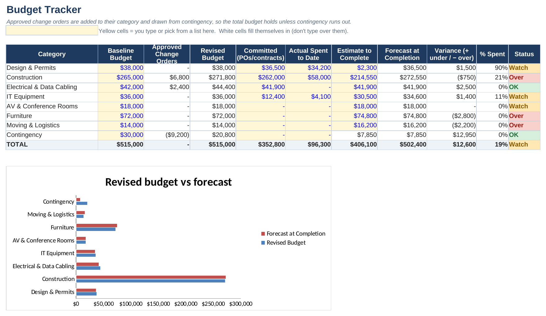
  • Budget with change orders (requests for extra money). Approved ones come out of the contingency cushion.
  • RFI & submittal log (questions to the architect, product approvals), a RAID log (risks, assumptions, issues and decisions) and meeting action items.
  • A dashboard and a weekly status report that write themselves from the numbers.
  • A 6-page document pack: project charter, meeting minutes, change request, follow-up email, status email and closeout checklist.

03How it works

  • One status date drives everything. Change it, and every task re-checks itself for that day.
  • A task is At Risk when it's more than 15 points behind where it should be, and Late when it's past its finish date and not done.
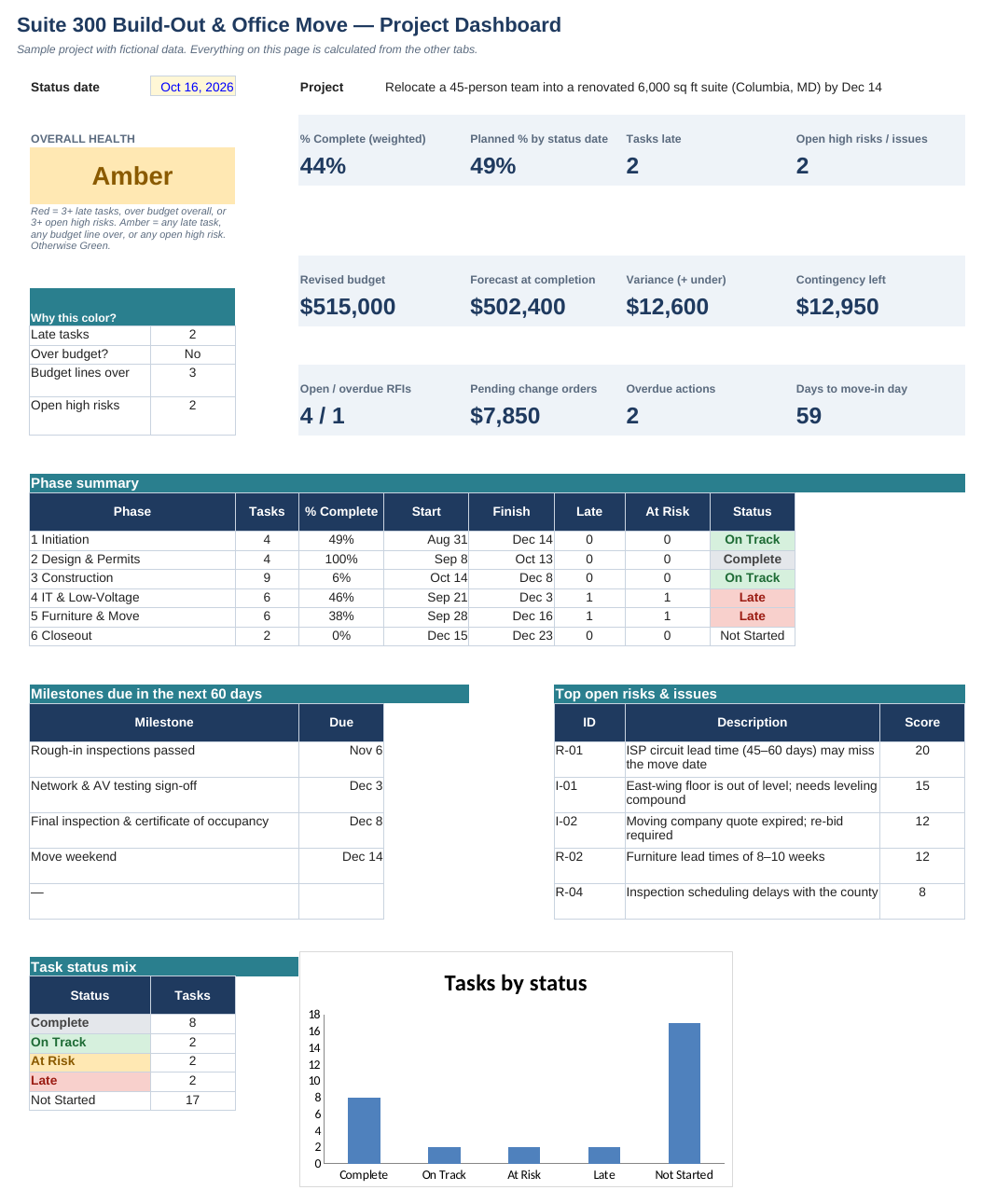
  • The project color follows written rules. A small "Why this color?" box on the dashboard shows exactly which rule is being hit.
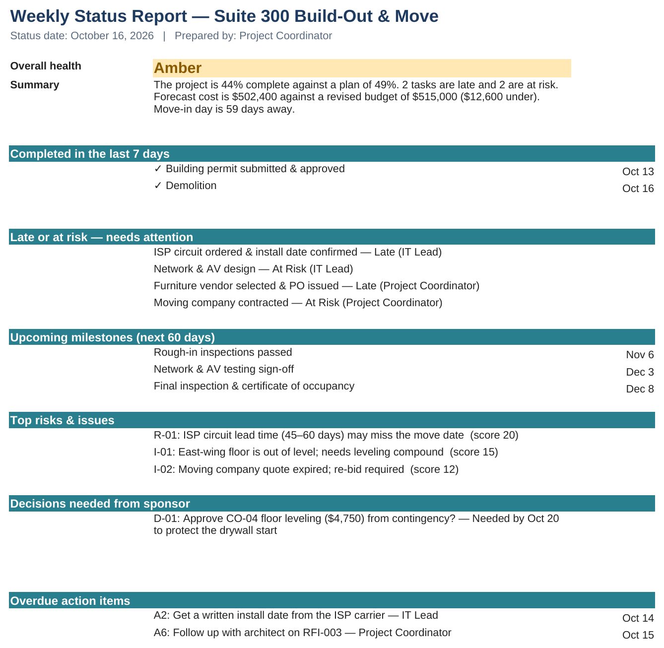
Status report: "The project is 44% complete against a plan of 49%. 2 tasks are late and 2 are at risk. Forecast cost is $502,400 against a revised budget of $515,000 ($12,600 under). Move-in day is 59 days away."

04How I built it

I started from the end result, the Friday status report, and worked backward to what has to be tracked to write it. I wrote each rule in plain English first ("what counts as late?") and then turned it into a formula.

I can do this math in my head for one task. But with 31 tasks, 8 budget lines and 4 logs, it's easy to miss something, so I'd rather have it built in and the same every time.

05Where it comes from

At MetroStar I tracked required training for staff, followed up on anything outstanding, and kept the records current in Excel and SharePoint. This is the same follow-through, applied to a whole project. I set it in construction and facilities because a lot of coordinator jobs around Baltimore and Columbia ask for RFIs, submittals and change orders by name.

06What I'd do next

Move the logs into a shared tool (SharePoint, Smartsheet or Microsoft Project) so the whole team can update them, and add a check for people booked on two tasks at once.

Try it yourself: Open the workbook, go to the Dashboard and change the status date (yellow cell) to Nov 20, 2026. Nothing else gets updated, so 11 tasks turn Late and the project goes Red.
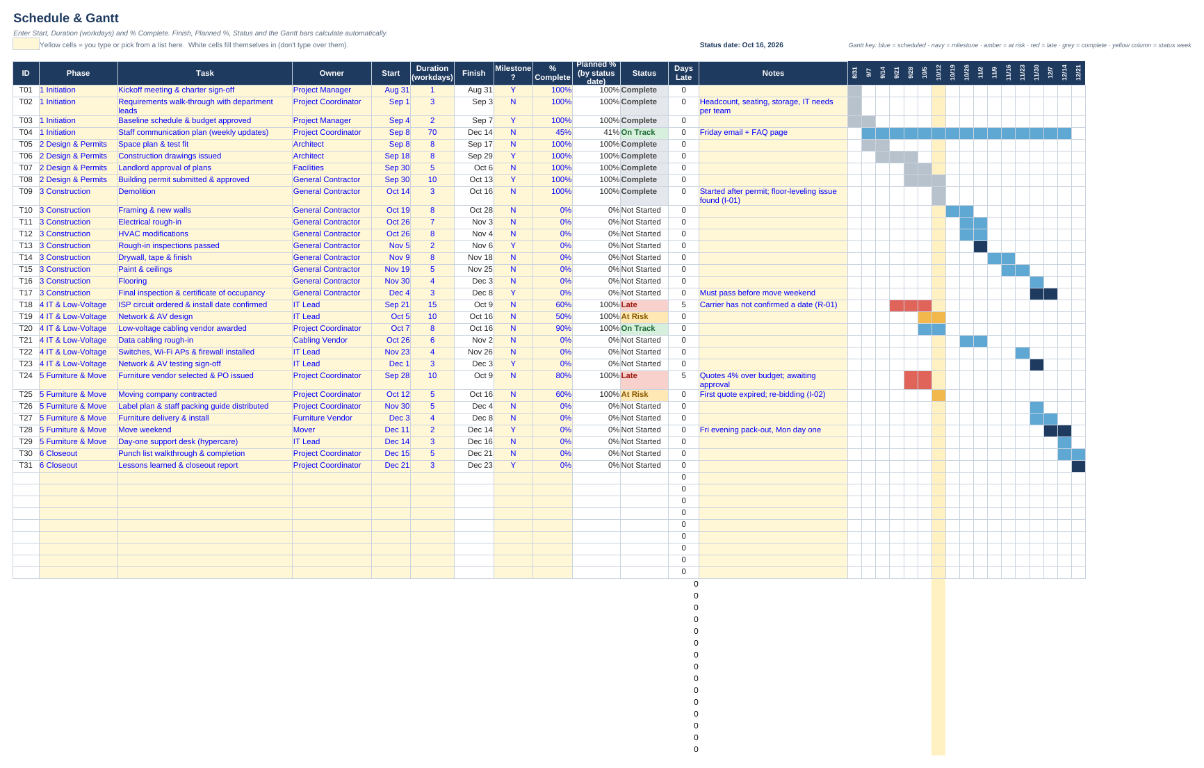
Schedule and Gantt: grey done, amber at risk, red late, navy milestones
Dashboard: overall color, why it's that color, key numbers and phase summary
The weekly status report, written by formulas
Budget: approved change orders draw down contingency
IT Project CoordinationITRolloutAsset trackingGo / No-Go

Laptop Refresh Rollout Tracker

Replacing 96 Windows 10 laptops in 3 waves

The tracker an IT project coordinator runs to swap out 96 aging laptops without losing anyone's files or leaving old laptops lying around. One row per laptop, a go/no-go gate before each wave, and the user emails and swap-day checklist that go with it.

01The problem

Replacing laptops sounds simple until it's 96 people. Each one needs a time slot, their files moved, multi-factor sign-in working and their apps checked. Then the old laptop has to come back, get wiped and come off the asset list. Miss one step and you get lost files, unhappy users, or a laptop with company data that nobody can find.

02What I built

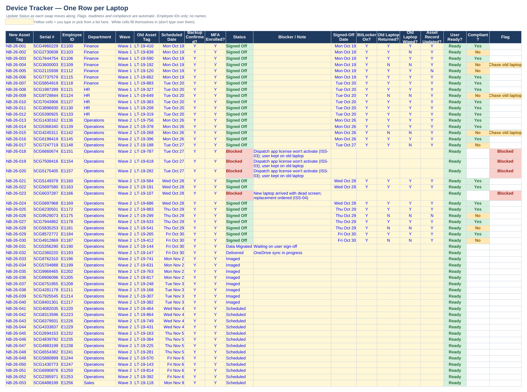
  • Device tracker: one row per laptop, moving from Scheduled → Imaged → Delivered → Data Migrated → Signed Off (or Blocked, with a reason).
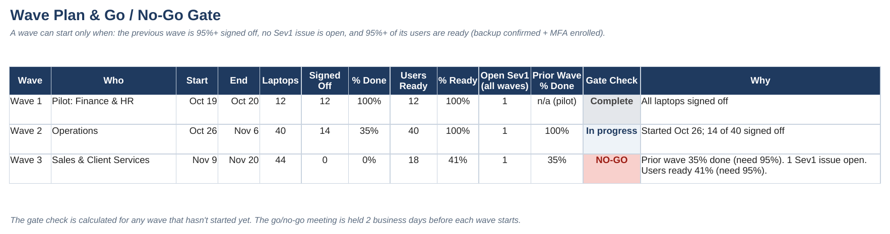
  • Wave plan with a go/no-go gate for each wave, explained in plain English.
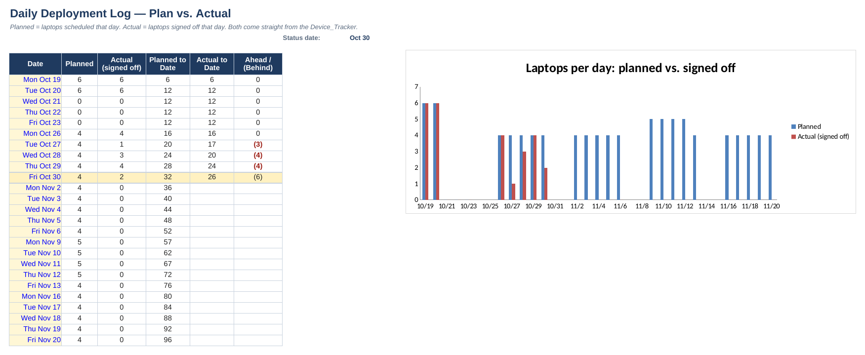
  • Issue log with severity and target dates, a daily plan-vs-actual log with a chart, and a user communication plan.
  • A 3-page rollout plan: who does what, a swap-day checklist, two user emails and a weekly status email.

03How it works

  • A user is Ready only when their backup is confirmed and MFA (multi-factor sign-in) is set up. Nobody gets swapped without both.
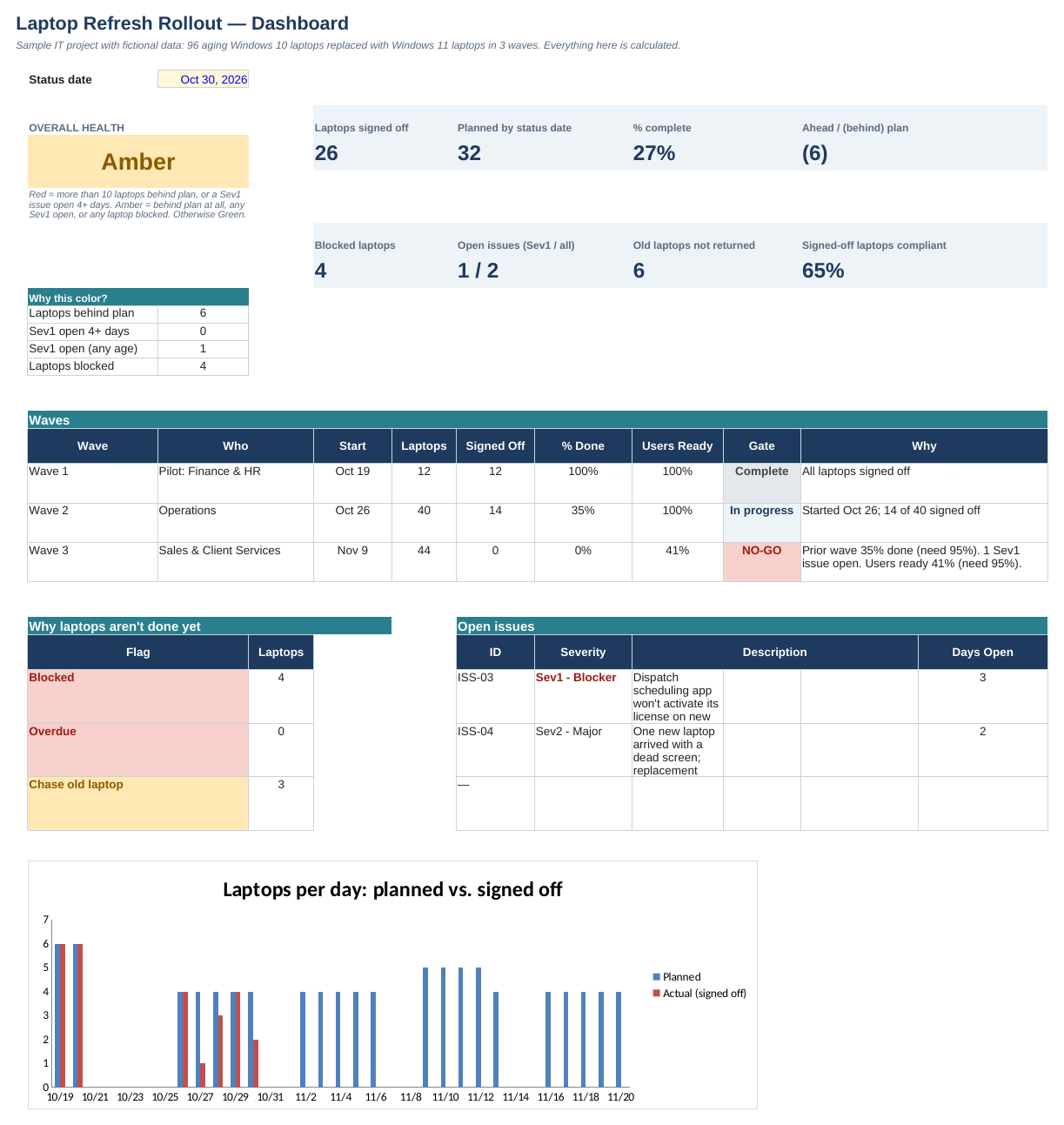
  • A signed-off laptop only counts as compliant when BitLocker encryption is on, the old laptop is back and wiped, and the asset list is updated. Right now 65% are; the rest are on the follow-up list.
  • The next wave can start only if the last one is 95%+ done, no blocking issue is open, and 95%+ of its users are ready.
Wave 3: NO-GO. "Prior wave 35% done (need 95%). 1 Sev1 issue open. Users ready 41% (need 95%)."

04How I built it

I listed every step a single laptop has to go through, from ordering to the old one being wiped, and gave each step a column. Then I added the rules a manager would ask about: is this person ready, is this laptop really done, can the next group start? The pilot wave goes first on purpose, so the problems (old docking stations, an MFA sign-in quirk) show up with 12 people instead of 96.

05Where it comes from

At MetroStar I handled account access, password resets and Microsoft 365 problems for staff and clients, so I've seen the sign-in and access problems people run into. My CompTIA Security+ is why the security checks (MFA, encryption, wiping old drives, asset records) are part of the definition of "done" and not an afterthought.

06What I'd do next

Connect the tracker to a SharePoint list so technicians update it from their phones on swap day, and send automatic reminders for unreturned laptops.

Try it yourself: In the Issue_Log tab, change ISS-03 to Resolved (with a resolved date). The Sev1 count drops to zero and Wave 3's list of reasons for NO-GO gets shorter.

Device tracker: one row per laptop with readiness, security checks and flags
Rollout dashboard: progress vs. plan, why it's Amber, wave gates and open issues
Wave plan: each wave's go/no-go gate, explained in words
Daily log: laptops planned vs. signed off each day

Turning messy numbers into decisions. The PMO report is the crossover: project coordination and data analysis in one.

Coordination × DataPMOReportingData qualityResources

PMO Portfolio Report

10 projects, one monthly update each, one page for leadership

A small project management office (PMO) setup. Every project manager submits one update a month, and the workbook judges every project by the same rules, catches updates that don't add up, and rolls it all into one dashboard and a 2-page report for leadership.

01The problem

When a company runs 10 projects at once, every project manager reports their own status, and almost everyone says "Green." Leadership can't tell which projects are actually in trouble until it's too late. Someone has to collect the updates, check them against the plan, and point to the few that need a conversation.

02What I built

  • Project register: each project's start date, planned finish and budget. This is the plan everything is measured against.
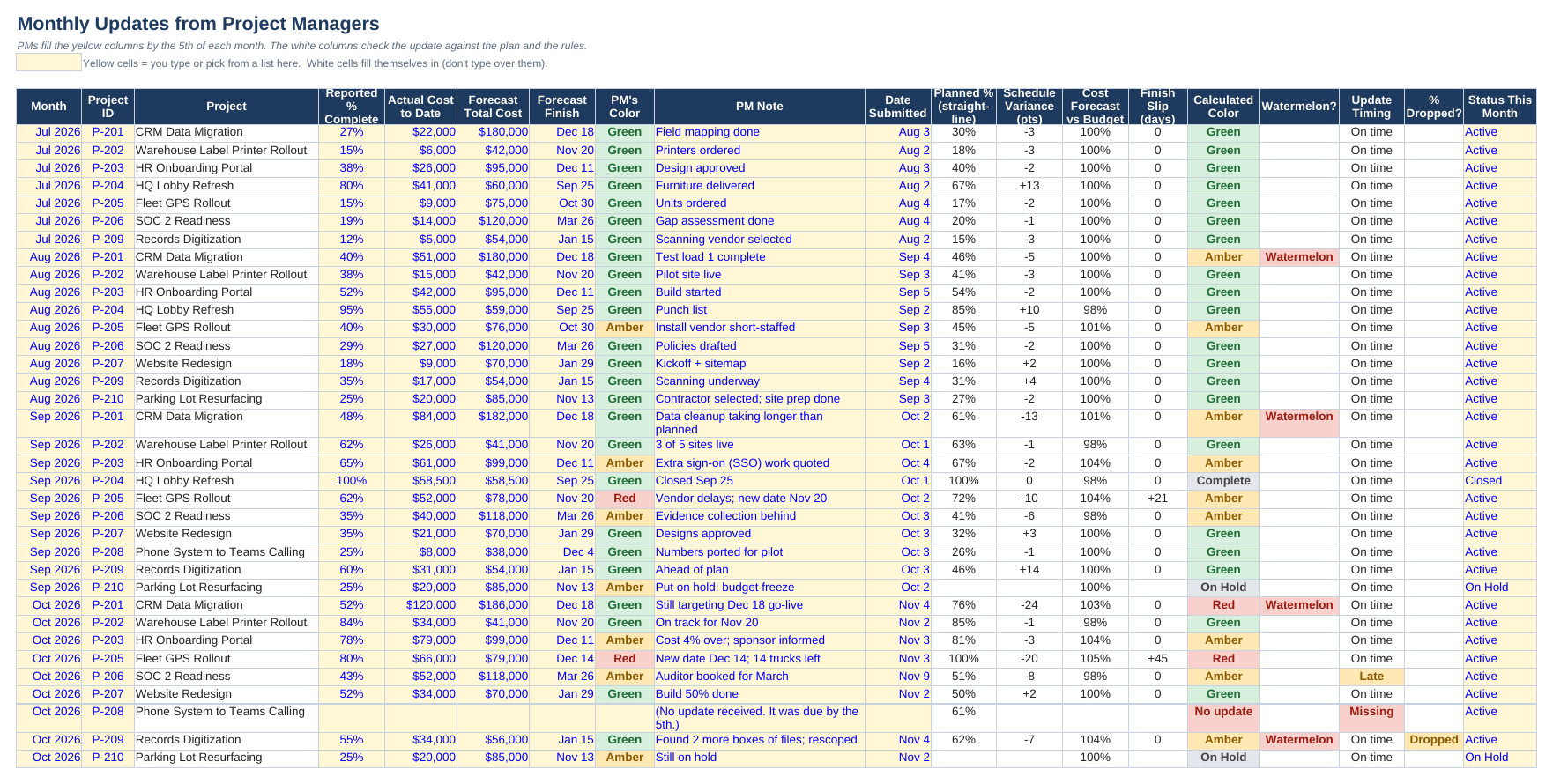
  • Monthly updates: 4 months of updates from 5 project managers, with automatic checks on each one.
  • Rules tab: the thresholds for Amber and Red, in one place.
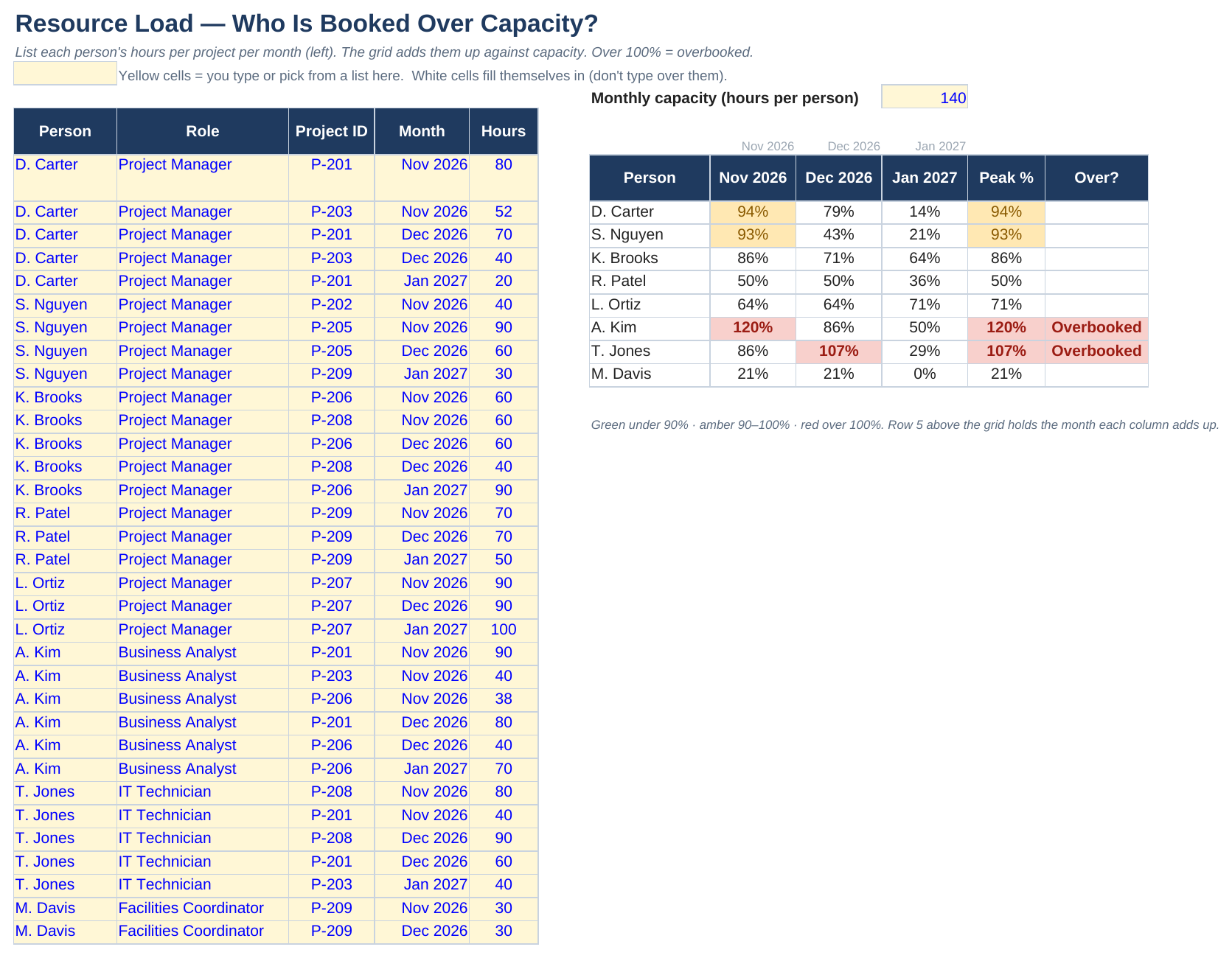
  • Resource load: who is booked over capacity in the next three months.
  • A dashboard you can switch by month, and a 2-page report with the decisions leadership needs to make.

03How it works

  • Planned % is simple: 50 days into a 100-day project, you should be about 50% done. The gap between reported % and planned % is the schedule variance.
  • Every project gets the same color rules: Red at 15 or more points behind, more than 10% over budget, or a slip of more than 30 days.
  • The workbook flags "watermelons" (reported Green, but the numbers say Amber or Red), missing or late updates, and % complete that went backwards.
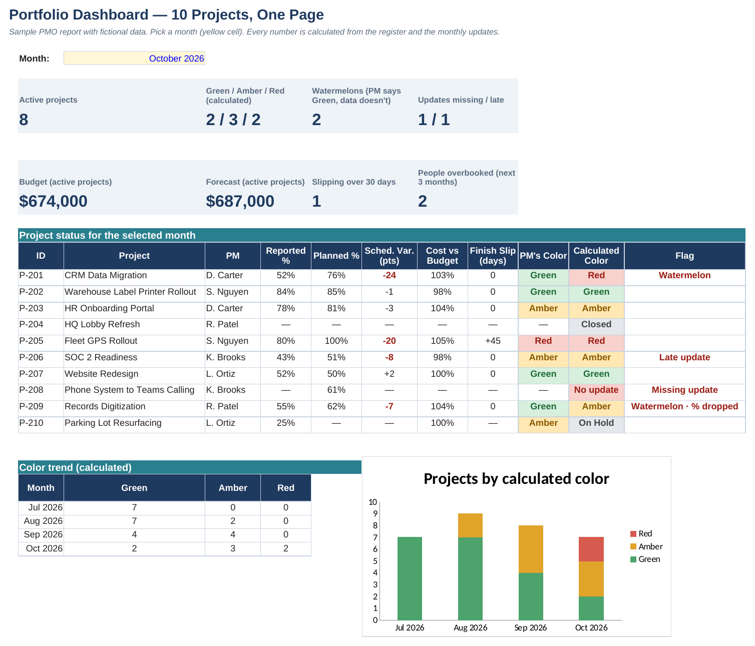
October: 2 / 3 / 2 Green / Amber / Red across 8 active projects (one didn't send an update), and 2 watermelons. P-201 reported Green for four months straight while falling 24 points behind.

04How I built it

I designed it the way a PMO actually works: the register holds the plan, project managers only touch their own monthly row, and every judgment comes from the Rules tab, so nobody's project gets graded differently. I kept every calculation in its own labeled column so anyone can follow it.

I can work out any one of these numbers by hand. But 10 projects × 12 months is 120 updates a year, and leadership needs every one judged the same way. A system does that without getting tired or playing favorites.

05Where it comes from

This combines the two things I'm best at: keeping track of lots of moving pieces (from MetroStar status tracking and coordinating events and club programs) and turning a pile of numbers into a clear recommendation (from the property comparisons I built at Profusion Real Estate).

06What I'd do next

Collect the monthly updates with a short Microsoft Form that feeds the sheet, and add a trend line per project so the drift is visible at a glance.

Try it yourself: On the dashboard, switch the month (yellow cell) to September 2026. P-201 was already flagged as a watermelon then: reported Green, 13 points behind.

Portfolio dashboard: every project, the PM's color vs. the calculated color, and flags
Monthly updates: each PM's numbers checked against the plan and the rules
Resource load: who's booked over 100% in the next three months
Data & Business OperationsData cleanupKPIsVendorsRecommendation

Work Order Cleanup & KPI Dashboard

A messy quarterly export → clean numbers → a recommendation

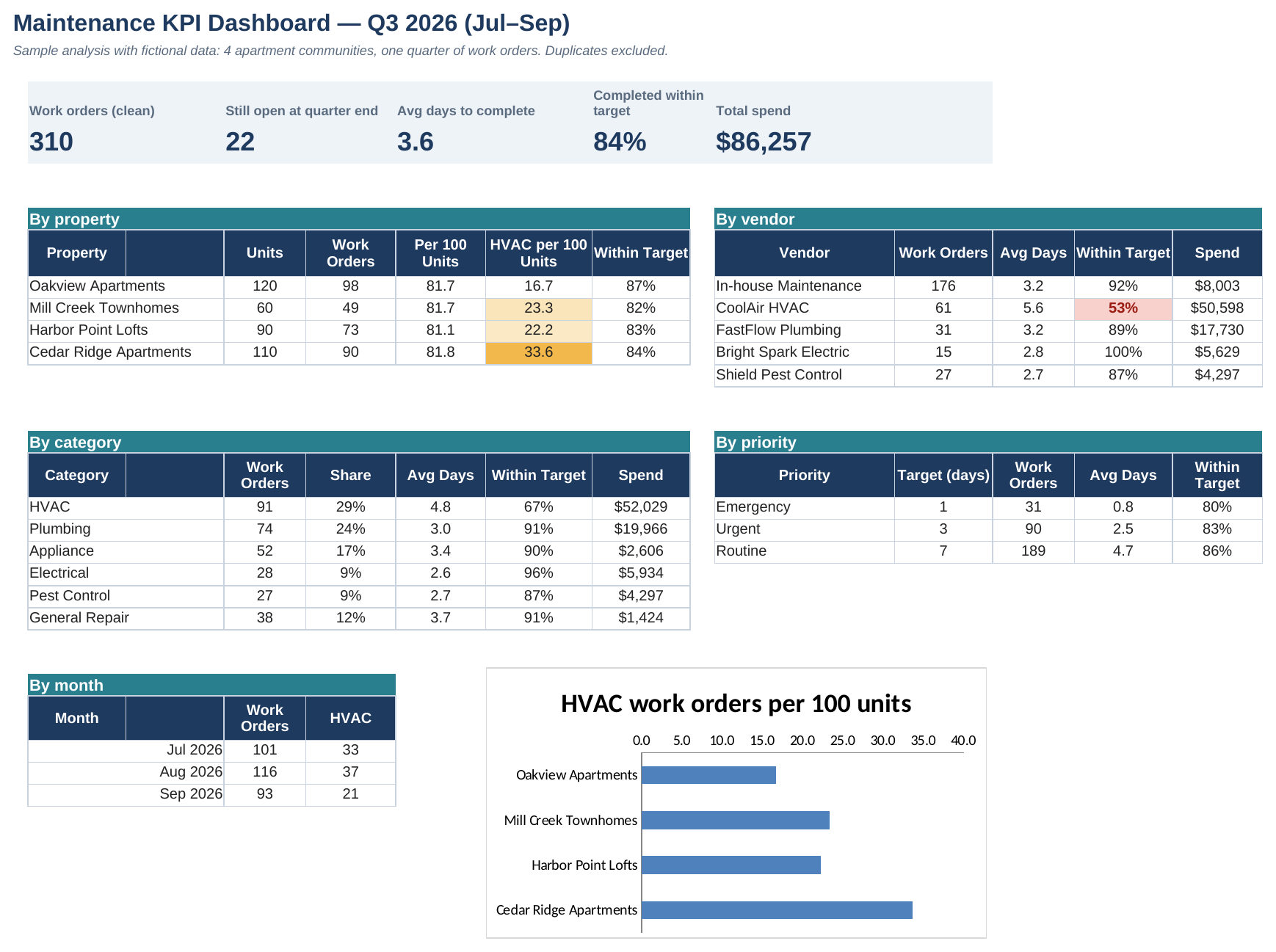
One quarter of maintenance work orders for 4 apartment communities, exported with all the usual mess. I cleaned 324 raw rows with formulas (not by hand), logged every fix, built a KPI dashboard and wrote a 2-page memo with what to do about it.

01The problem

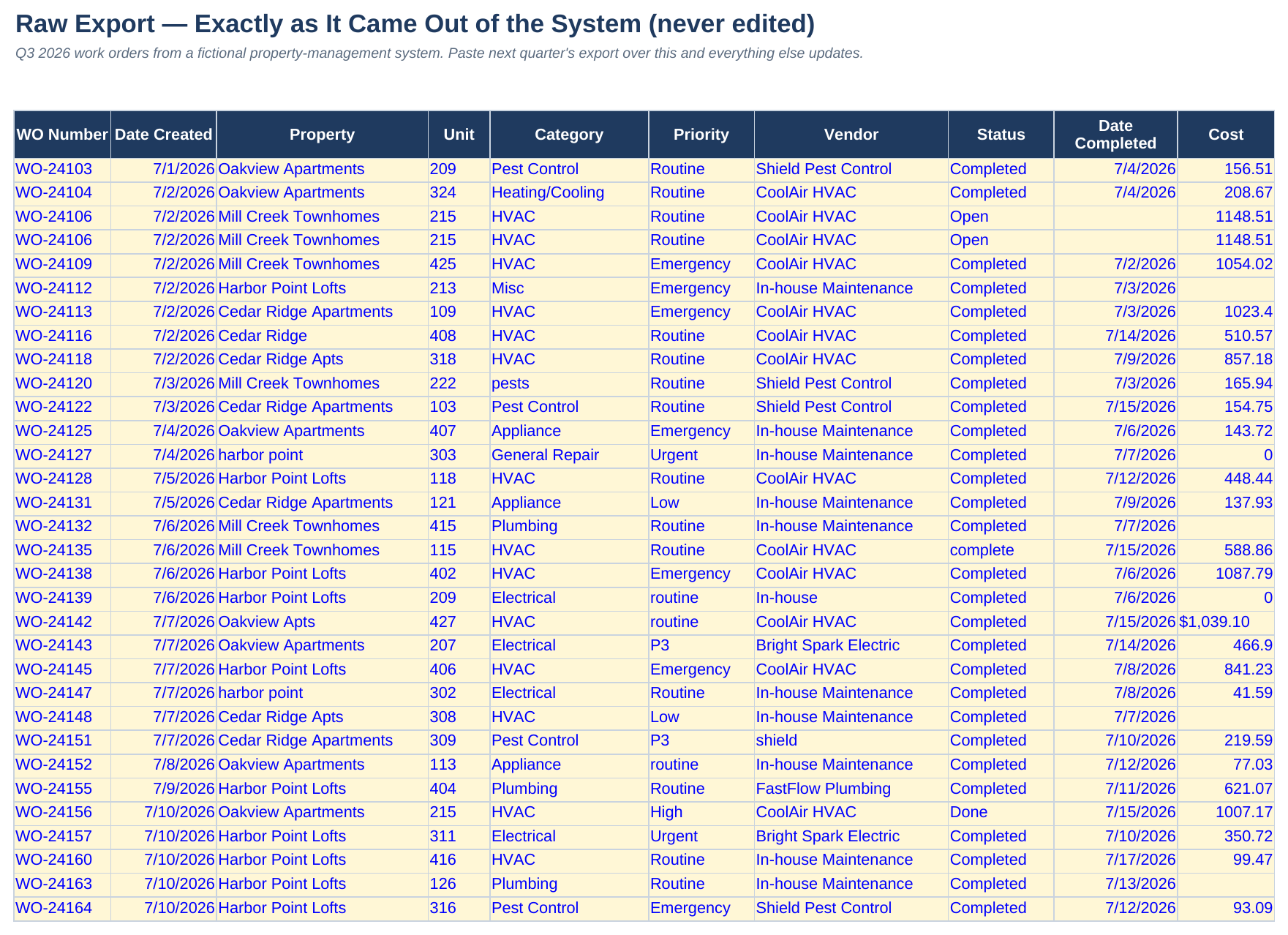
Real data is messy. The same property is spelled four different ways, one person types "P1" and another types "Emergency," costs come through as text, and some rows are exported twice. Until that's fixed, any total or average is wrong, and decisions get made on bad numbers.

02What I built

  • Raw export, kept exactly as it came out of the system. I never edit it.
  • Cleanup rules: lookup tables that turn every spelling into one standard name.
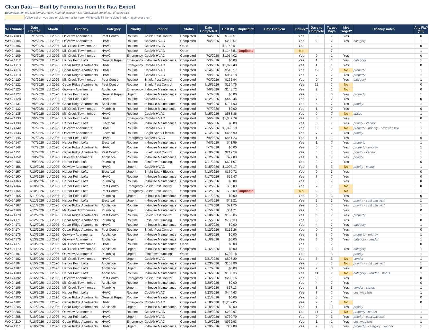
  • Clean data: every row standardized by formulas, with duplicates and bad dates flagged and days-to-complete calculated.
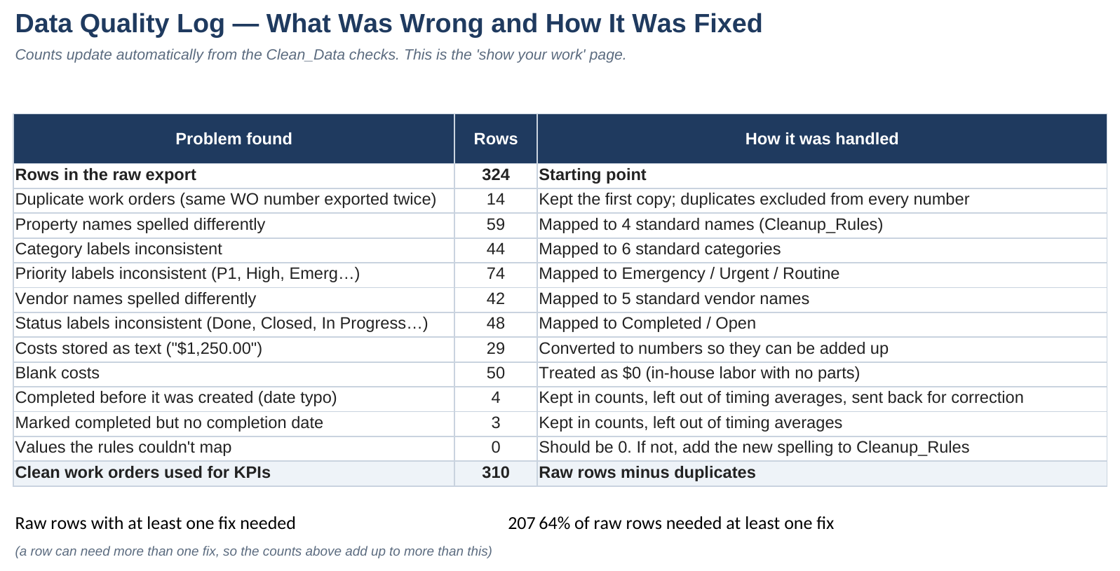
  • A data quality log showing how many rows had each problem and how it was handled.
  • A KPI dashboard by property, vendor, category, priority and month, plus a 2-page memo with recommendations.

03How it works

  • 207 of 324 raw rows needed at least one fix, including 14 duplicates. 310 clean work orders went into the numbers.
  • "Per 100 units" makes a 60-unit property and a 120-unit property fair to compare.
  • If next quarter's export has a spelling the rules haven't seen, a "couldn't map" check turns red instead of quietly miscounting.
Memo: "HVAC is 29% of work orders but 60% of maintenance spend… the main HVAC vendor hits its response target only 53% of the time."

04How I built it

I kept the raw data untouched and did every fix as a rule, so the cleanup can be checked and repeated. Next quarter you paste in the new export and every number updates. Then I asked the questions a manager would ask: where's the money going, who's slow, and is any property different? I wrote the memo with the answer first.

05Where it comes from

I've worked on the property side: at Profusion Real Estate I compared properties in Excel and helped set up and furnish rental units. Working at The Hall CP and Holy Cross Hospital also showed me how much depends on records being entered the same way every time. The memo's last recommendation (drop-down lists so the data comes in clean) comes from that.

06What I'd do next

Rebuild the same steps in Power Query so the cleanup runs with one refresh, and add a month-over-month view once there are two quarters of data.

Try it yourself: In Raw_Export, change a property name to oakview apts: Clean_Data still reads "Oakview Apartments." Type a brand-new misspelling and the Data_Quality_Log's "couldn't map" check turns red.

KPI dashboard: volume, speed, on-time % and spend by property, vendor, category and priority
Data quality log: every problem found and how it was handled
Before: the raw export, exactly as it came out
After: clean data built by formulas, with notes on what was fixed

Judging AI output consistently, and planning a product from scratch.

AI EvaluationRubric designQuality assuranceConsistencyAudio

AI Audio Evaluation Kit

Scoring AI-generated music the same way every time

Guidelines and a scoring workbook for judging AI-generated music clips: a weighted rubric with written examples for each score, 12 named failure types, rules for tricky cases, and a check that measures whether my scores hold up when I re-score the same clips five or more days later.

01The problem

Evaluating AI output is judgment work, and judgment is only useful if it's consistent. Two reviewers, or the same reviewer a few days later, should give the same clip the same score for the same reasons, and name the exact problem so engineers can fix it.

02What I built

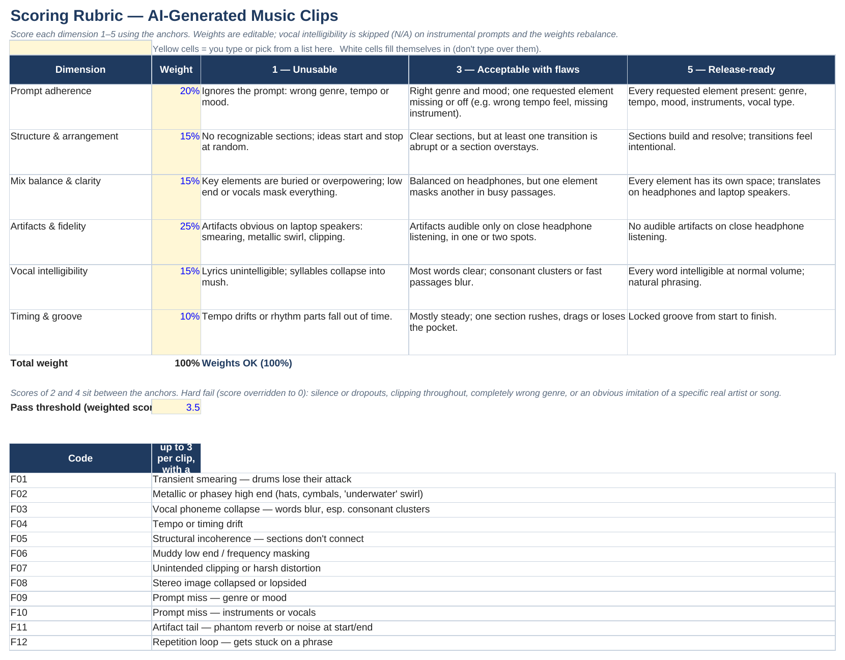
  • Guidelines (PDF): listening setup, a 6-part rubric with written 1/3/5 examples, automatic-fail rules, 12 failure codes with "don't confuse it with" notes, 8 tricky-case rules, and weak vs. strong written explanations.
  • Scoring workbook: weighted scores, pass/fail, failure counts by model, a model-vs-model dashboard and a consistency check.
  • An appendix on lyric transcription, from preparing lyrics for a 15-song distribution project.

03How it works

  • Each clip gets a 1–5 score on six things (prompt match, structure, mix, artifacts, vocals, timing), weighted into one score.
  • Every problem gets a code and a timestamp, e.g. F01 "drums lose their attack" at 0:12.
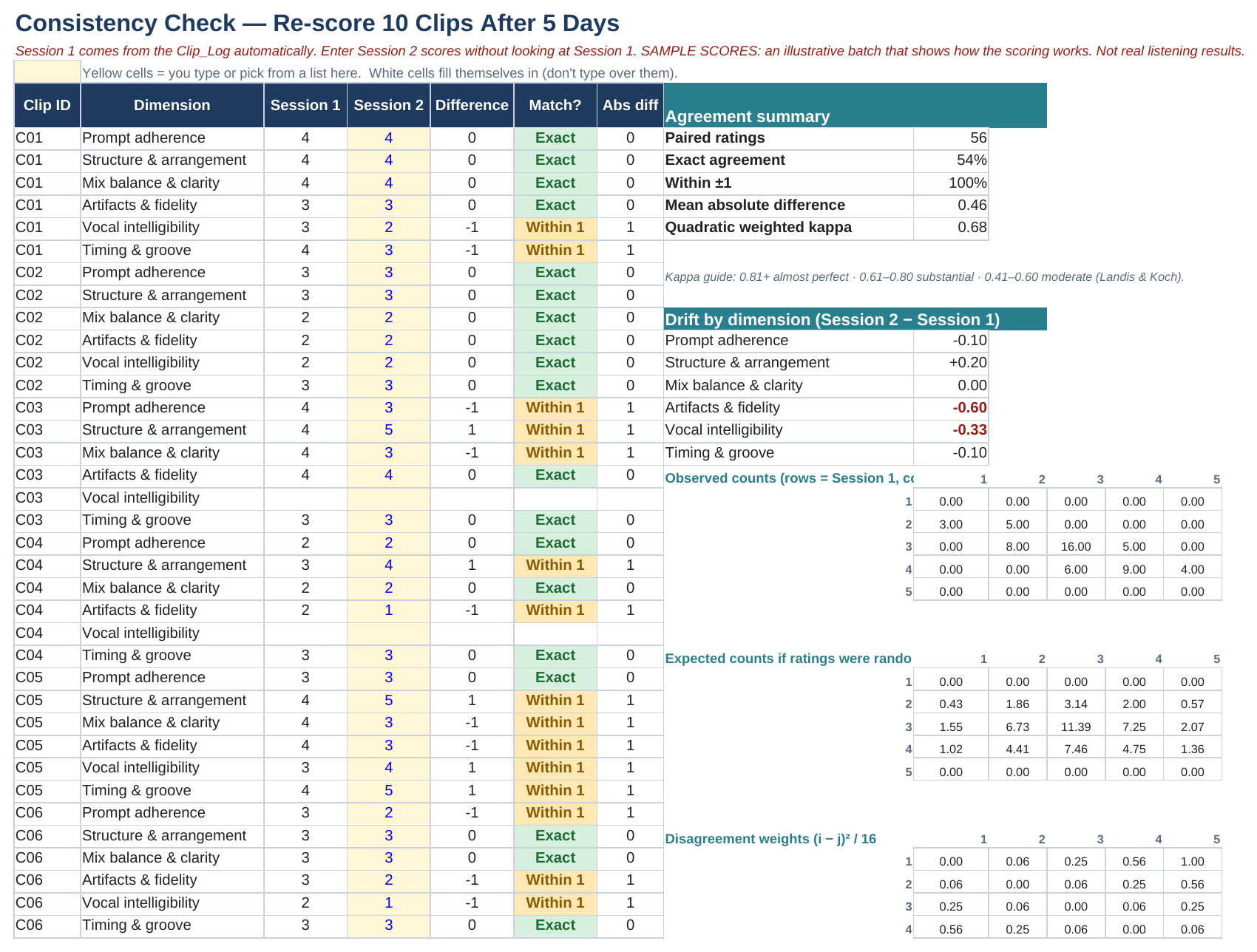
  • Re-scoring 10 clips later shows how often my scores matched and drifted, using a standard agreement measure (weighted kappa). The sample scores miss a couple of the targets, which shows what the warnings look like.
Tricky-case rule: "Saturated 808s in trap and drill are expected. Tag F07 only if the distortion spreads to other elements or crackles at peaks beyond what the genre expects."

04How I built it

I wrote the score descriptions before listening to anything, so the rubric decides the scores and not the other way around. For each failure type I wrote what it sounds like and what it's easily confused with, because that's where reviewers disagree. The workbook comes with a sample batch of scores so every formula has something to show; they're labeled as samples, not real results.

05Where it comes from

This comes from my audio work: setting up and recording sessions as a Technical Operations Intern at WMUC (watching gain staging, catching clipping, tracing problems in the signal chain), producing music in Logic Pro, FL Studio, Ableton Live and Ardour (including a self-released album), and preparing lyrics for a 15-song distribution project, where keeping dialect spellings consistent was the hardest part.

06What I'd do next

Give the guidelines to a second reviewer, have us both score the same clips separately, and use the consistency check to find where we disagree and tighten those rules.

Try it yourself: On the Rubric tab, change any weight so they no longer add up to 100%. The check next to the total turns red: "Weights must add up to 100%."

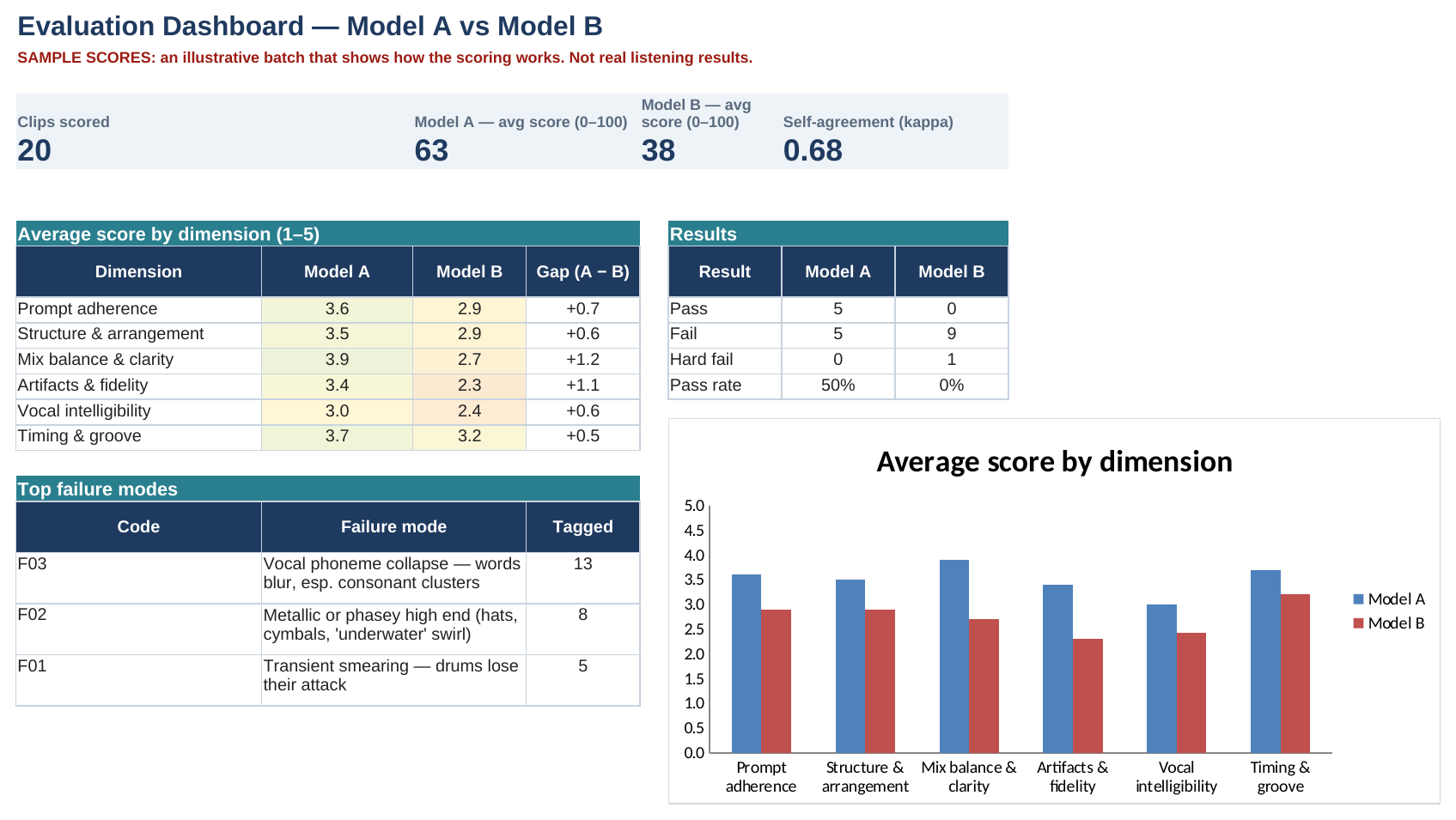
Evaluation dashboard (sample scores): model comparison and top failure types
Rubric with written examples for each score, plus the failure codes
Consistency check: how well scores match when re-scored later
Product OwnershipRequirementsDecision logAI-assisted buildmacOS

SIF'S Sample Box

Planning a Mac app from a problem in my own workflow

A personal product project: a focused Mac app that prepares audio samples, cuts loops, maps them to pads and hands them off to a music program. This case study covers how I defined it, made the decisions and planned an AI-assisted build. The app is in development.

01The problem

In my own music production, getting samples ready took longer than making music: cleaning up the audio, finding the tempo and key, cutting usable loops, mapping them to pads. The big music programs can do all of it, but only through a dozen steps spread across menus. I wanted one tool that does the prep and hands off.

02What I built

  • A written boundary first: this is not a full music program. No tracks, mixer, plug-ins, mastering, accounts or cloud.
  • A 14-document specification package: vision and requirements, five ranked priorities, a ten-step build plan, six research areas and a summary.
  • A decision log marking every decision as locked, testable, open, deferred, rejected or withdrawn, with the reason.
  • A licensing review: which audio code libraries can't be used and what to use instead.

03How it works

  • Priorities are ranked, so every trade-off has a default answer.
  • The build is split into ten steps. Each one has to show working proof before the next starts.
  • The plan is built to prevent the three worst failures for an audio app: glitches, lost work, and output that's confidently wrong.

04How I built it

I used AI tools for research and drafting and treated them like a fast junior teammate. My rule was to never cite a source nobody actually opened. When the package was done, I answered 12 decisions myself, then had a second AI tool check the whole package against my answers and flag conflicts instead of settling them quietly.

05Where it comes from

This project taught me the most about coordination. Writing down what the product isn't saved more time than any feature idea. A decision log stops the same questions from being argued every week. And a plan is only as good as its definition of "done" for each step.

06What I'd do next

Build the audio-prep core (the first steps of the plan) and test it on my own sample library before adding anything else.

About

My work has mostly sat between systems and the people using them. At MetroStar I've coordinated deliverables and follow-ups, tracked required training, kept records current in Excel and SharePoint, and handled account and Microsoft 365 support. At Profusion Real Estate I built property comparisons and coordinated rental setups. At Holy Cross Hospital I managed visitor access in a regulated environment, and at The Hall CP I worked high-volume service and events and trained new staff.

As a Technical Operations Intern at WMUC radio I scheduled, set up and recorded studio sessions. I was Vice President of Education for the Maryland Cybersecurity Club and coordinated events for the Maryland Music Business Society. Outside of work I produce music (a self-released album and a 15-song distribution project).

Let's talk

I'm looking for project coordinator, IT project coordinator, operations and business analysis roles. Email is the best way to reach me:

adamjasifo@gmail.com

Open in your email app →

Download my résumé (PDF) →